
웹에서 하는 ggplot 과, 그 코드를 보며 Rstudio에서 따라 해보고 있는 중입니다
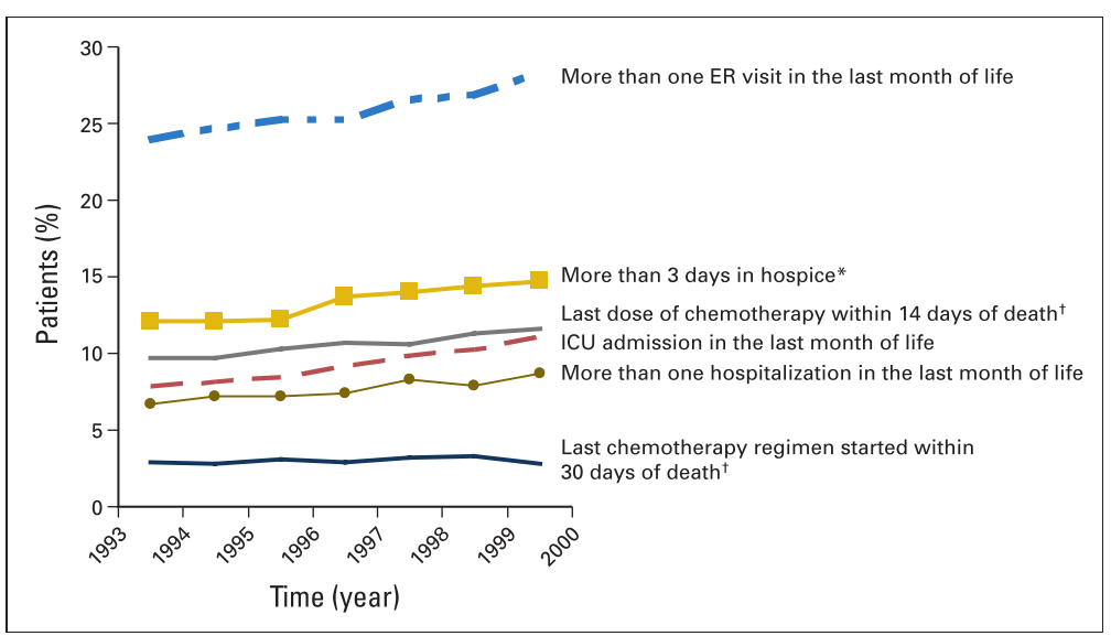
다름이 아니라 다음과 같이, 선그래프 각각의 끝에 범례를 붙이는 그래프는 어떻게 구현이 가능할까요?
여러개의 범주를 한 그래프 내에 동시에 표현해야 해서, 색깔과 형태 지정을 각각 해야하고 범례를 각 그래프 꼬리에 따라붙게 구현하려 합니다.
Comment 3
-
cardiomoon
2020.03.19 16:02
-
erynies
2020.03.24 13:58
21명 중 호스피스를 받은 환자가 11명.. 이런 자료입니다.
퍼센트로 변환하여 그래프에서는 퍼센트로 표현하구요,
비율에 대한 연도별 변동 트렌드가 있는지 보는 chchrane-amitage test 의 p값을 구했는데,
최종 구현을 위 예시처럼 그래프의 꼬리 끝에 범례를 붙이고, p값도 같이 붙이고자 합니다.
-
cardiomoon
2020.03.25 08:57
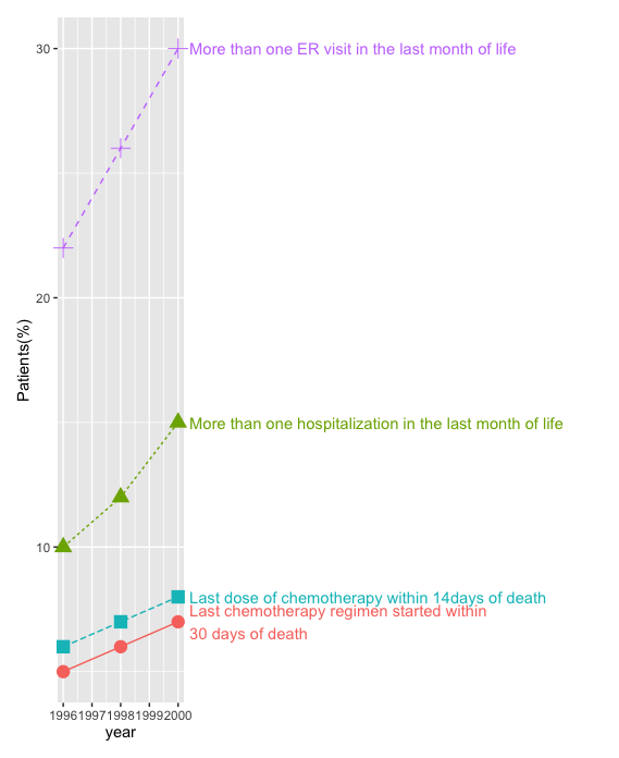
보내주신 자료를 보았지만 해석이 불가능하여 임의로 자료를 만들어 비슷하게 구현해봤습니다.
library(ggplot2)
group=1:4
y1=c(5,10,6,22)
y2=c(6,12,7,26)
y3=c(7,15,8,30)
df=data.frame(group,y1,y2,y3)
colnames(df)=c("group","1996","1998","2000")
require(tidyr)
longdf=pivot_longer(df,cols=c("1996","1998","2000"),names_to="year")
longdf$year=as.numeric(longdf$year)
labels=c("Last chemotherapy regimen started within\n30 days of death",
"More than one hospitalization in the last month of life",
"Last dose of chemotherapy within 14days of death",
"More than one ER visit in the last month of life")
longdf$group=factor(longdf$group,labels=labels)
longdf2=longdf[longdf$year==2000,]
ggplot(data=longdf,aes(x=year,y=value,group=group,color=group))+
geom_point(aes(shape=group),size=4)+
geom_line(aes(linetype=group))+
geom_text(data=longdf2,aes(x=year+0.4,y=value,label=group),hjust=0)+
coord_cartesian(xlim=c(1996,2000),clip="off")+
theme(plot.margin=unit(c(1,25,1,1),"char"))+
theme(legend.position="none")+ylab("Patients(%)")
데이터를 올려봐주시면 한번 해보겠습니다